E-commerce · 2015
Only for Men
Pioneered responsive mobile UX and images in 2015 — patterns adopted across 26 client projects
Built from scratch for Only for Men, this full-stack e-commerce platform combined an ASP.Net/VB backend with a modern responsive frontend. The project became a launchpad for innovation: the responsive mobile navigation and picture-element image system developed here — both rare in 2015 — were later adopted across 26 other e-commerce client projects.
As Senior Front-end Developer, I built the Only for Men e-commerce platform from scratch — taking full ownership of both the ASP.Net/VB backend and the entire frontend layer.
Full-stack from day one The project ran on ASP.Net with a VB backend. Rather than staying strictly in the front-end lane, I worked across the stack to ensure the data model, routing, and templating all supported the frontend experience I wanted to deliver.
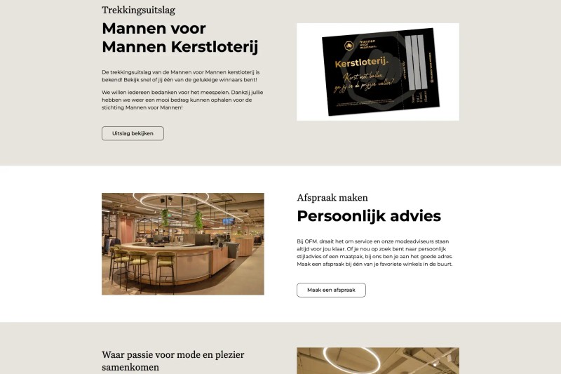
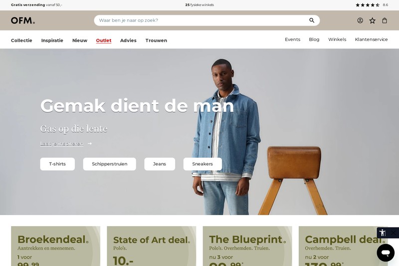
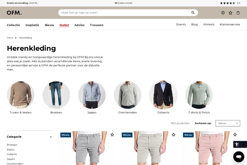
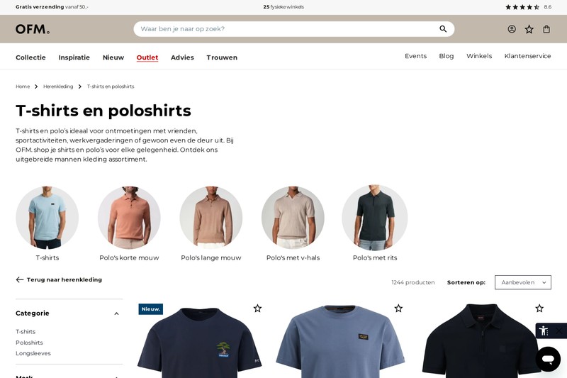
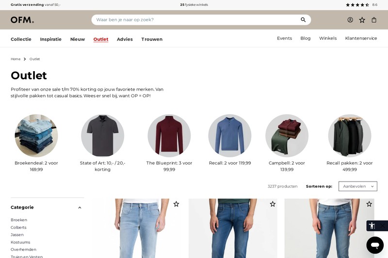
Responsive mobile navigation — before it was standard In 2015, a properly implemented mobile navigation was the exception rather than the rule. Most sites either collapsed to a hamburger that broke on touch devices or skipped mobile entirely. For Only for Men I designed and built a responsive mobile menu from the ground up: accessible, touch-friendly, and smooth on every screen size. The feedback was strong enough that we packaged it as a reusable solution and it was adopted across 26 subsequent e-commerce client projects.
Responsive images with the picture element The `picture` element and `srcset`/`sizes` attributes had barely been ratified by the time this project launched. I implemented full responsive image support across the product catalogue and editorial content — serving the right resolution to the right device and cutting unnecessary image payload significantly. This pattern was later standardised and rolled out across the client portfolio.
The bigger impact Beyond the site itself, the work done on this project set a new baseline for how we approached e-commerce builds. The mobile navigation and responsive image components became part of our standard toolkit, delivering measurable improvements in mobile experience and page weight across 26 client projects that followed.
Measurable outcomes
- 26client projects
Component adoption
Reusable mobile nav and responsive image components adopted across 26 subsequent e-commerce client projects
- 2015
Year launched
Colour palette
- Warm Sandbackground#c2b8ab
- Stonemuted#d5d5d5
- Whiteforeground#FFFFFF
- Blacktext#000000
- Midnightaccent#111624
Typography
- The quick brown fox jumps over the lazy dog